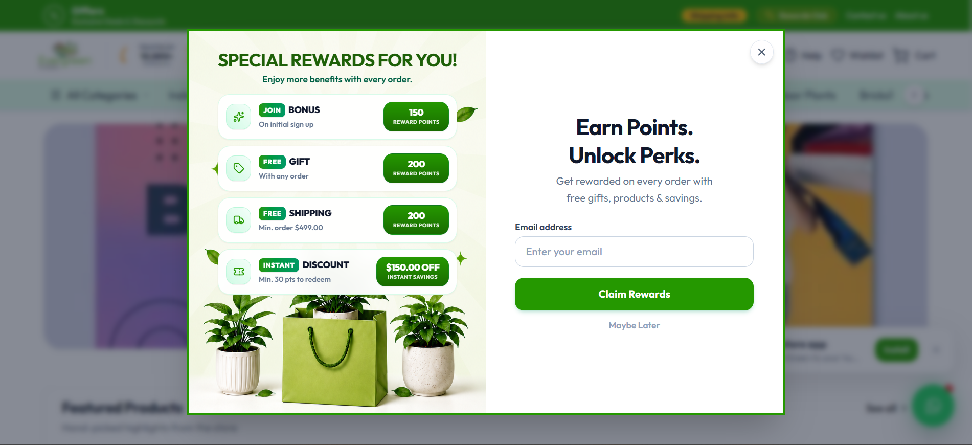
Summary of Changes: 1. Prevented Scrolling on Large Screens: - Replaced `overflow-y-auto` with `max-md:overflow-y-auto md:overflow-hidden` so that desktop and laptop screens will never show a scrollbar. - Replaced the fixed `md:min-h-[630px]` with responsive height `md:h-[clamp(510px,86vh,620px)]`, ensuring the modal adapts dynamically to your screen's viewport height without overflowing.
2. Grounded Bottom Artwork (Plants & Bag): - Changed the background alignment from `bg-center` to `bg-[center_bottom]`, ensuring the potted plants, green gift bag, fallen leaves, and table shadow are anchored to the bottom border and fully visible without getting cut off.
3. Compact Card Spacing & Typography: - Balanced vertical padding (`sm:p-5 md:p-6`, card padding `p-2 sm:p-2.5`, `space-y-1.5 sm:space-y-2`) so all 4 benefit cards fit cleanly above the plants with ample breathing space. - Kept the right-column perks copy, email field, Claim Rewards button, and Maybe Later action centered and fully visible within the frame.